Metrics and observability strategy: measuring without fooling yourself
Posted on February 18, 2026 • 16 minutes • 3259 words
Table of contents
- Before the dashboard: why we measure (and why we don’t)
- Logs, metrics, and traces: the trio that tells the whole story
- SLI, SLO, and SLA: putting numbers on “it kinda works”
- DORA: measuring how you deliver, not whether you’re “busy”
- MTTR and friends: how fast you get back on your feet
- Good metrics, toxic metrics
- Security and cost: the two places where people lie the most
- DevEx: measuring how miserable your day-to-day is
- The “bare minimum” to not fly blind
- Quick glossary
- Sources and references
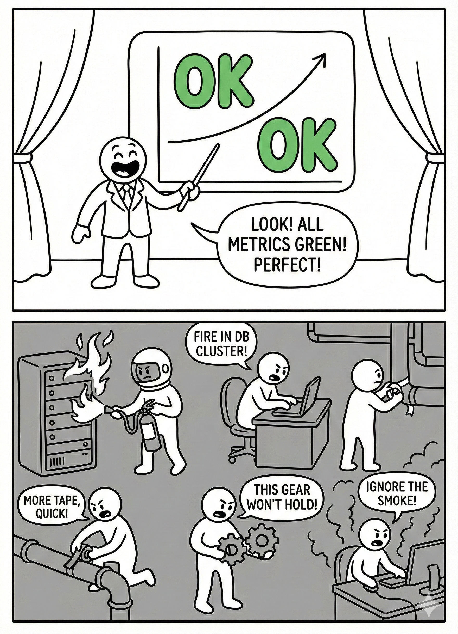
In almost every team, there’s a magical moment when someone opens a dashboard, points at a green graph, and says: “See? We’re doing great.” Meanwhile, support is on fire, the payments API is going down every other hour, and the development team hasn’t slept properly in three weeks.
The difference between a healthy team and one stuck in that endless theater usually comes down to how they use metrics: as a flashlight to see better… or as a stick to beat each other with.
This article is about the flashlight.
Before the dashboard: why we measure (and why we don’t)
Imagine your system is an airplane flying at night. The instrumentation is there so you don’t fly into a mountain in the fog, not so the pilot can announce over the PA, “look how lovely everything is from up here.” Metrics are exactly that: instruments .
We measure for four very specific reasons:
- To know if we’re delivering software well: how often we deploy, how long changes take to reach production, how many deployments break something. That’s where DORA metrics come in.
- To know if the system behaves well for the user: how we’re doing on errors, latency, availability. That’s where SLIs and SLOs live.
- To know if we can fix things fast when everything goes sideways: MTTR , time to detection, time to response.
- To know what it feels like from inside the team: how much time we spend firefighting, how much on planned work, how much we lose waiting for eternal builds or absurd approval chains .
Of course, some companies, teams, or managers tend to turn metrics into other things entirely:
- A gladiator scoreboard (“the dev with the most closed tickets,” “the one with the most commits”).
- A prop to justify decisions that were already made.
- A cute little number we optimize even though it has nothing to do with actual value (hello, story points per sprint).
If your metrics don’t help you make better decisions or work with less pain, they’re not metrics — they’re decoration.
Logs, metrics, and traces: the trio that tells the whole story
The “observability” jargon can sound like just another buzzword, but at its core it’s about three types of signals that answer different questions .
Logs: what the heck happened
Logs are the system’s diary. That’s where you record errors, requests, state changes, business decisions. “order_id=1234, status=PAID, payment_provider=stripe” is a good log entry: it tells you what happened, to whom, and in what context.
A very real example I’ve lived through:
A user swears you’ve charged them twice. If all your logs show is Error occurred and not much else, you’re toast. If you can see the order’s journey, the payment attempts, and the provider’s callbacks, you can reconstruct the scene and respond with something better than “we’ve opened a ticket.”
Metrics: how healthy things look from 30,000 feet
Metrics are numbers aggregated over time: CPU, memory, p95 latency, error rate, number of pending jobs in a queue, etc. They don’t tell you the full story, but they do tell you “something’s off here.”
A graph of http_server_requests_seconds spiking on the payments API, or a queue_length{queue="emails"} growing non-stop, are elegant ways for the system to scream “heads up — I’m about to blow!” before the users do.
Traces: who did what with a request
Traces are the map of a request’s journey through your services. In a microservices world, seeing that checkout-api calls cart-service, then pricing-service, then payment-gateway, and finally email-service, with times and errors, is pure gold.
When a user clicks “buy” and everything is slow, the trace lets you see whether the problem is in the database, the payment gateway, or that mysterious service nobody’s wanted to touch since 2013.
Putting it all together:
- Metrics tell you “something’s wrong here.”
- Traces tell you “it’s going wrong exactly at this point in the flow.”
- Logs tell you “and this is what happened when it blew up.”
That’s the level of observability you want — not 200 pretty dashboards to show off in the quarterly review.
SLI, SLO, and SLA: putting numbers on “it kinda works”
When business asks “is this working well?”, you can answer with “yeah, more or less” or you can talk SLOs. The second option tends to generate fewer arguments and fewer passive-aggressive emails.
In very short form:
- An SLI is something you measure: percentage of successful requests, p95 latency, 5xx error rate.
- An SLO is the target you set for that SLI: “we want at least 99.9% of payments to complete successfully per month.”
- An SLA is what you promise the client by contract: “if monthly uptime drops below 99.5%, we give you money back.”
The beauty of SLOs, as the SRE world keeps insisting, is that they aren’t decorative: they give you an error budget. If your SLO is 99.9%, you’re explicitly accepting that 0.1% of requests can fail. That margin tells you:
- How hard you can push with new features.
- When you should hit the brakes and focus on fixing things for real.
If in two weeks you’ve already burned through 80% of your error budget on the critical API, it’s probably not the best time for the “grand redesign” that touches every moving part. Or maybe it is… but at least you’ll know you’re playing Russian roulette with data in front of you.
DORA: measuring how you deliver, not whether you’re “busy”
DORA metrics are like that friend who, when you tell them how swamped you are, replies: “okay, but… what have you actually shipped?” They’re about your system’s ability to deliver changes, not about how fast you’re running down the hallway.
There are four (plus a fifth in recent iterations ):
- Deployment frequency: how often you push changes to production.
- Lead time for changes: how long it takes a change to go from “done” to running in production.
- Change failure rate: what percentage of deployments break something (rollback, hotfix, incident).
- MTTR: how long it takes to fix the mess when it happens.
- And, increasingly, a general notion of reliability.
Imagine two teams:
- Team A deploys once a month, takes 3 weeks to get a change to production, breaks 5% of releases, and takes a day to recover.
- Team B deploys daily, takes 1 day to get a change to prod, also breaks 5% of releases… but recovers in an hour.
Who “works harder”? Doesn’t matter. Team B has a delivery system designed to absorb frequent changes and cheap failures: more deploys, smaller, more reversible. That’s what correlates with high-performing organizations — not the number of closed tickets.
DORA is, in essence, an antidote to productivity theater.
MTTR and friends: how fast you get back on your feet
Beyond DORA, there’s another family of metrics that tell very human stories: incident metrics.
- MTTR : how long you’re broken, on average.
- MTTD: how long it takes you to realize you’re broken (spoiler: sometimes you find out on Twitter).
- MTTA: how long until someone says “okay, this is mine, I’m on it.”
This is where good observability really shows. Without it, the flow goes something like:
Angry customer → Slack/Teams on fire → 30 minutes to reproduce the failure → 1 hour of “let’s figure out which service it is” → another hour until someone finds the killer query.
With decent metrics, logs, and traces, the script changes:
Two minutes in, an alert fires because the error rate on checkout has spiked. You see that latency in
payment-servicehas gone through the roof. You open a trace and discover the call to the external provider is taking 10 seconds because of something they changed on their end. You can mitigate, roll back, degrade gracefully, show up at the provider’s office with a chainsaw… all before half the world has filed a ticket.
It’s not about having zero incidents (that’s fantasy) — it’s about making sure they aren’t total wrecks every single time.
Good metrics, toxic metrics
A healthy metric changes your behavior for the better. A toxic metric, on the other hand, only changes how you game the system.
And in engineering, we’ve been gaming poorly designed systems for years.
Some examples of metrics that tend to help:
- User-centric SLOs: “the checkout page responds in under X ms 99% of the time,” “the error rate on login is below Y%.”
- DORA metrics, when used to understand the team, not to pit people against each other.
- Production defects by functional area, to see which part of the system needs more love.
- Percentage of unplanned vs. planned work.
And then you have examples of metrics that go sideways the moment you look at them wrong:
- Story points per person / per sprint.
- Commits per developer.
- Number of closed PRs.
- Hours “in the office” or “connected to Slack.”
If a metric can be easily gamed without actually improving anything — for instance, slicing tasks into a thousand tiny PRs to look more productive — someone will do it. And if you turn it into a KPI on top of that, you’re pinning a medal on that behavior .
Your strategy should look something like:
- Few metrics, well chosen, at the system or team level.
- Review them with the team, not broadcast them from an ivory tower.
- Periodically ask yourself: “Are we actually changing something real thanks to this data, or are we just chasing a prettier number?”
Security and cost: the two places where people lie the most
There are two areas where metrics tend to get especially surreal.
Security
The classic: “we have 300 open vulnerabilities, we need to bring that number down.” No context. No priorities. No distinction between a critical CVE exposed to the internet and a false positive in an isolated environment.
A more serious approach looks at things like:
- How long it takes you to resolve critical vulnerabilities that actually affect you.
- How many real security incidents you’ve had.
- How many features go through threat modeling or security reviews before hitting production.
And yes, logs, metrics, and traces matter here too: it’s hard to investigate an attack if you can’t reconstruct what happened.
Cost (FinOps)
Another gem: “we’re spending too much on cloud, cut spending by 30%.” Without saying which part of the system generates value, which part is underutilized, or what “too much” even means.
Talking about cost seriously means things like:
- Cost per service, per environment, per business unit.
- Cost per transaction, per 1,000 requests, per active customer.
- Relating that to value metrics (customers you retain, revenue, margin).
A decent metrics and observability strategy lets you talk about “this data access pattern costs us X per month and brings in Y — is it worth it?” instead of just crying in front of the invoice.
DevEx: measuring how miserable your day-to-day is
Developer experience (DevEx) isn’t some fluffy concept — it has very measurable symptoms. Instead of asking “are you happy?” and calling it a day, you can look at concrete things:
- How long it takes from “I want to make a change” to having a working environment ready.
- How long the build and test suite take on each commit.
- How many times a week you get blocked by another team, a manual approval, or an absurd process.
- How much of your time goes to firefighting vs. moving planned work forward.
There are recent reports on developer productivity that point to exactly these factors as decisive: it’s not so much about how many hours you spend writing code, but how many of those hours are actually productive.
Measuring DevEx isn’t group therapy — it’s an elegant way of justifying why it’s worth investing in better pipelines, better tooling, or fewer meetings.
So then… what’s the retro even for?
If you already have DevEx metrics, DORA, SLOs, and half an observatory set up, it’s tempting to think the Scrum retrospective is unnecessary. It isn’t — but it doesn’t work the way it was sold, either.
The original idea is lovely: the team meets every sprint, talks about what went well, what went badly, and agrees on concrete actions to improve. On paper, it’s an engine for continuous improvement. In practice, most retros follow a pretty predictable script:
- Someone says “deploys take too long.”
- Someone else says “I got blocked waiting for another team to respond.”
- A third person says “meetings are eating our lives.”
- Two or three “action items” get written on a sticky note.
- At the next retro, nobody remembers the previous action items and the same complaints come up again.
The root problem? There’s no data. It’s all perception. And perceptions, while valid and real, have two enormous flaws as a driver of change:
- You can’t prioritize them rigorously. “Deploys take too long” could mean 8 minutes or 45. “I got blocked waiting” could have been once that week or every single day. Without numbers, everything carries equal weight, so you end up acting on whatever makes the most noise in the room, not on whatever has the most impact.
- You can’t verify whether the action helped. If we decide to “improve deploys,” how do we know next retro whether we succeeded? With another perception: “yeah, it seems a bit better.” Or worse: nobody remembers and the action dies in silence.
Compare that with what happens when the retro has real data on the table:
| Without data (classic retro) | With data (informed retro) |
|---|---|
| “Deploys take too long” | “Our average lead time this sprint was 4.2 days; a month ago it was 2.8” |
| “I got blocked several times” | “35% of our PRs waited more than 24h for the first review” |
| “We spend too much time firefighting” | “This sprint, 40% of our time went to unplanned work; last sprint it was 25%” |
| “Feels like there are more bugs” | “Change failure rate has gone from 8% to 14% in the last month” |
Suddenly, the conversation changes at its core. It’s no longer “I feel like…,” it’s “the data shows that…, why?” And that “why?” is exactly where the retro does shine: discussing causes, context, nuance, and possible solutions.
What the retro can’t do on its own — and where it constantly fails — is detect the problem and measure whether the solution worked. For that, you need metrics.
Put another way:
- Metrics tell you what is happening and how much it hurts.
- The retro helps you discuss why it’s happening and what you’re going to do about it.
- Metrics from the next iteration confirm whether what you did actually made a difference.
Without that complete cycle, the retro is a periodic venting session disguised as an improvement process. Useful for morale (sometimes), useless for changing anything structural.
And there’s another problem that rarely gets mentioned: retros reward the most articulate complaints, not the most important problems. The senior developer who speaks clearly and with charisma gets their annoyance turned into an action item; the junior who’s been wrestling with a broken dev environment for weeks says nothing because “maybe it’s just me.” With DevEx data (environment setup time, build times, frequency of external-dependency blocks), that problem surfaces without anyone needing to dare bring it up in a room.
Does this mean we should eliminate retros? No. It means we need to stop asking them for what they can’t deliver: diagnosis and follow-through. The retro works when it arrives with the homework done — data on the table — and focuses on what it actually does well: generating conversation, context, and the team’s commitment to one concrete, verifiable action.
The formula that works best, stripped of fanfare:
- Before the retro: prepare 3-4 relevant metrics from the sprint (lead time, change failure rate, % unplanned work, a key SLO). You don’t need a NASA-level dashboard; a couple of simple charts will do.
- During the retro: present the data, let the team react and discuss causes. Agree on one concrete action (not five) with a measurable expected outcome.
- At the next retro: the first thing you look at is whether the metric that motivated the action has changed. If it has, celebrate. If it hasn’t, discuss why and decide whether to keep pushing or change approach.
That turns the retro from a sticky-note ritual into a real improvement cycle. And as a bonus, it solves the most common problem: actions evaporating between sprints because nobody tracks them with anything more solid than collective memory.
And if you think I’m particularly frustrated by how useless most retros are — and that’s maybe why I’ve given this section extra space — you’d be right. The human side of software development deserves its own article (or several), and I’ll be talking about this Game of Thrones soon.
The “bare minimum” to not fly blind
As a conclusion to this article, and so you walk away with a useful reminder — if I had to define a basic package, something like “observability and metrics for normal teams that don’t want to build a NASA mission control,” it would be this:
- A handful of clear SLOs tied to things the user cares about (2-3 key operations, their availability and latency).
- DORA metrics , even if approximate, to see whether you’re getting better or worse at delivery.
- Structured logs , technical and business metrics, and traces at least on the critical services.
- A periodic review with the team where you ask:
- What are we seeing.
- What are we going to change because of it.
- Which metrics can we throw in the trash because they’re no longer helping.
You don’t need to start with everything automated or with the most expensive tool on the market. What you need, above all, is to be clear that metrics serve decisions and people — not the other way around.
If your graphs don’t help you catch problems before your users do, deliver better, and make smarter decisions about design, security, and cost, then yeah — they’re just pretty pictures for the next presentation. And for that, honestly, there’s always PowerPoint.
Quick glossary
So you don’t get lost in the jargon.
- SRE (Site Reliability Engineering): a discipline (and role) that combines software engineering with infrastructure operations. Focused on building scalable and reliable systems. Popularized by Google .
- p95 / p99 (95th / 99th percentile): the value below which 95% or 99% of observations fall. If your API’s p95 latency is 200 ms, 95% of requests are faster than that; the remaining 5% is where problems tend to hide.
- Error budget: the acceptable margin of failure derived from your SLO. If your target is 99.9% availability, your error budget is that 0.1%. While you have margin left, you can take risks; when it runs out, it’s time to stop and stabilize.
- CVE (Common Vulnerabilities and Exposures): a unique identifier for publicly known security vulnerabilities (e.g., CVE-2024-12345).
- FinOps: a practice of financial management for cloud spending that combines finance, technology, and business to make informed decisions about cost and infrastructure investment.
- Threat modeling: a secure design exercise in which threats, attack surfaces, and necessary controls are identified before writing code, not after.
Sources and references
Because I stand on the shoulders of giants…
- The Pillars of Observability - IBM
- DORA Metrics Guide - DORA
- Service Level Objectives - Google SRE Book
- SRE Fundamentals: SLIs, SLAs and SLOs - Google Cloud Blog
- Mastering DORA Metrics: A Practical Guide - FreyaFusion
- The 2024 State of Developer Productivity - Cortex
- DORA Metrics: History - DORA
- Developer Productivity Metrics: Missing the Point - Swarmia
- CVE - Fortinet
- Secure by Design: The Complete Guide - Checkpoint
- Practice Security by Design - Salesforce Trailhead
- How to Implement and Track DORA Metrics - Port