Toxic metrics: story points, commits, and other creative ways to fool yourself
Posted on April 13, 2026 • 19 minutes • 3932 words
Table of contents
- When the KPI is “looking busy,” not creating value
- The lines-of-code theater: the Twitter/Musk saga
- The catalog of toxic metrics (and how they go sideways)
- What metrics actually make some sense (and what they look like in real life)
- How not to turn good metrics into the next toxic metrics
- Stop counting keystrokes and start measuring decisions
- Quick glossary
- Sources and references
There are many ways to wreck a development team.
You can force them to use a framework nobody asked for, make them estimate every last comma in a four-hour meeting, or —my personal favorite— slap the wrong metrics on them and call it “data-driven management.” It sounds polished, plays great in a slide deck, and the damage takes just long enough to show up that whoever’s responsible has already been promoted.
When you turn story points, commits, or lines of code into a target, you’re not measuring productivity: you’re designing a game where everyone is going to learn how to cheat.
And the worst part is you can’t blame them, because that’s exactly the rational thing to do when the rules are broken.
When the KPI is “looking busy,” not creating value
In 1975, Charles Goodhart —a British economist advising the Bank of England— coined an idea that should be tattooed on the forehead of every engineering director: “When a measure becomes a target, it ceases to be a good measure.”
He was thinking about monetary policy, but like all good truths, it applies universally.
In software engineering, we’ve spent decades proving Goodhart was being generous: we don’t just stop measuring well — we manage to make the metric say exactly what we want to hear.
Story points as a productivity gauge
Imagine a manager who shows up on a Monday and announces, brimming with confidence: “from now on we’re going to measure individual productivity in story points, so we’ll know who’s pulling their weight.” He says it with the same certainty as someone proposing to measure a restaurant’s quality by counting the number of plates coming out of the kitchen.
By the first retro, someone’s already figured out the trick: “if this task that used to be a 3 is now tagged as a 5, suddenly we’re more productive without writing a single extra line.” Miracle. Holy inflation.
Story points are a relative estimate of complexity, not a unit of delivered value. A “3” on one team doesn’t mean the same thing on another, or even on the same team six months later. Mike Cohn , who popularized their use through Mountain Goat Software , has spent years explaining that story points estimate relative effort, not absolute complexity, and certainly not individual productivity.
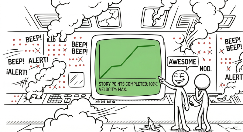
But it doesn’t matter how many times he says it: the moment someone with access to a spreadsheet decides that “velocity = performance,” planning turns into a numbers game where whoever inflates the most wins, whoever estimates honestly looks slow, and product quality takes an indefinite vacation. Teams start splitting tasks into absurd subtasks just to rack up points, inflate estimates so the chart doesn’t dip, and dodge difficult or uncertain work because “it might tank our sprint average.” Nobody wants to be the one responsible for the curve going down, even though the curve means absolutely nothing.
Commits per developer
The commits saga is even more entertaining. Counting commits tells you how many times someone pressed git commit, not whether they did anything useful. It’s like measuring a writer’s productivity by counting how many times they hit “Save.” Trivially gameable
: split a coherent change into ridiculous commits, save every typo fix as a separate commit, swap spaces for tabs, and —voilà— your “productivity” curve skyrockets. Your code is a disaster, but the dashboard shines.
Some companies have actually deployed public dashboards showing commits per person “to foster transparency.” What they actually foster is the opposite: people stop doing deep refactors (because touching a lot of code in few commits looks “weak”), seniors reduce the time they spend reviewing others’ code (because reviews don’t add to your leaderboard), and you start seeing commits like rename variable, fix typo, add whitespace, all carefully separated to make the chart go up.
In a Reddit thread worth reading, a developer described how they ended up making commits for trivial changes and formatting tweaks just to boost their metrics, creating an absolute nightmare of noise for whoever had to review and maintain that code afterward. On the dashboard it looked gorgeous; in the codebase, it looked like a tornado with OCD had blown through.
Lines of code (LOC)
And then there are lines of code, the cockroach of metrics: you can throw decades of literature at it and it’s still there, showing up in “productivity” slide decks with the same resilience cockroaches show for surviving everything else.
More lines of code don’t mean more value. In the vast majority of cases, good design means fewer lines: clearer, more maintainable, easier to reason about. Martin Fowler —one of the signatories of the Agile Manifesto and a go-to authority on refactoring and software architecture— has spent years writing about how measuring by LOC incentivizes exactly the opposite of what you want: verbosity, artificial complexity, and zero refactors. If you reward lines added, nobody wants to delete dead code (“deleting costs you points”), simple solutions get rejected because “they don’t look like enough,” and implementations get bloated with layers of abstraction that exist solely to make the number go up. It’s like rewarding a surgeon for time spent in the operating room instead of the patient’s health: technically measurable, practically suicidal.
The result is documented to death: companies that try to measure productivity with points, commits, or LOC end up with beautiful numbers… and mediocre software, mounting technical debt, and cynical teams that have learned their job isn’t to build a good product but to survive the next QBR with presentable metrics.
The lines-of-code theater: the Twitter/Musk saga
If you need an example of an absurd metric elevated to the rank of martial art, look no further than October 2022. When Elon Musk —CEO of Tesla, SpaceX, and at that point the freshly minted owner of Twitter for the modest sum of 44 billion dollars— took control of the social network, one of the first things he did was ask engineers to print out their recent code for review. Yes, print it out. In 2022. As if version control were a passing fad.
As reported by Le Monde , The Guardian , and Business Insider (which immortalized the image of Musk leaving a “code review” at 1:30 AM, as if that were something to brag about), the number of lines of code produced was considered an important signal for deciding who stayed and who went in the mass layoffs that followed. One of the fired managers described it as “people making decisions about people they don’t know, based on the number of lines of code they’ve written — completely absurd.”
The tech community reacted, as expected, with a mix of horror and ridicule. Reducing an engineer’s work to “how many lines did you write” ignores everything that makes a technical person valuable: refactors that cut complexity, eliminating dead code, design work that prevents unnecessary code from being written in the first place, PR reviews that save the team from costly mistakes, or solving complex problems that are precisely about not adding code but understanding why the existing code doesn’t work. Bloomberg analyzed how those indiscriminate layoffs wiped out institutional knowledge that took years to build. Fortune documented the waves of resignations that followed once the survivors understood the rules of the new game.
If you incentivize lines of code, you get lines of code. Not good software. It’s a textbook case of how a grotesque metric can lead to equally grotesque decisions, with direct impact on culture, system quality, and trust in leadership. Though, to be fair, it was also a textbook case of quite a few other things.
Trusting Elon Musk’s ideas is like trusting a monkey with a crossbow, but that’s another story for another time.
The catalog of toxic metrics (and how they go sideways)
Not all toxic metrics come with a famous company’s logo or need an eccentric billionaire to cause damage. The patterns repeat over and over, in garage startups and Fortune 500 corporations alike, with the same predictability as the office coffee always being cold when you need it hot.
Story points completed per sprint / per person
When someone decides to use story points to measure individual performance, you’ve got all the ingredients for a three-act tragicomedy. The underlying problem is simple: story points are subjective, relative estimates, not units of measurement. Using them as a KPI is like measuring someone’s intelligence by how many times they say “synergies” in a meeting.
What typically happens in practice is a well-documented spiral of madness. Points get inflated because nobody wants their chart to dip. Difficult or uncertain work is avoided like the plague, because it threatens the “velocity.” Important tasks get chopped into absurd subtasks —things that could be one commit become five tickets— just so “the system” rewards you. In a revealing thread on r/agile , technically brilliant teams that were honest with their estimates ended up looking “worse” than teams that inflated their points and churned out mediocre features at full speed. The difference wasn’t in value delivered, but in who knew how to play the numbers game better.
Number of commits
As an individual metric, the number of commits has the same analytical depth as counting how many times someone opens the fridge to evaluate whether they eat well. It doesn’t measure size, value, or quality of the change. But that doesn’t stop it from regularly showing up on dashboards labeled “high-performance engineers.”
The effects are so predictable they’re almost boring to list: tiny, noisy commits that clog the history and make it impossible to follow the context of a real change; less deep work because deep work usually materializes in a few substantial commits (which look “weak” in the stats); and seniors who stop reviewing others’ code because spending two hours preventing a junior from shipping a critical bug adds absolutely nothing to the leaderboard.
And the saddest part is watching seniors stop reviewing others’ code, because spending an hour on a thorough review helps the team enormously… but it doesn’t add a single commit to your counter.
PR count falls into the same trap as commits, but with more ceremony around it — like putting lipstick on a pig somehow makes it more respectable. Not all PRs carry the same weight: one might be fixing a word in a README and another might be an architecture migration that took three weeks of design, negotiation, and pain.
When you turn closed PRs into a target, what you get isn’t more productivity — it’s more bureaucracy dressed up as output. Trivial PRs proliferate, work gets fragmented to the point of absurdity (adding more review overhead than actual value), and people open “prep” PRs that could perfectly go together, but split apart they score more points. It’s the corporate version of slicing a sandwich into pieces so you can say you ate five courses.
Lines of code added
We already covered the Musk case, but the problem is much broader than one billionaire with a flair for spectacle. Any system that rewards LOC added creates a perverse incentive: resisting the deletion of dead code becomes rational behavior, refactors vanish because you’re subtracting lines, and solutions get artificially bloated because the system pays you for it. It’s like rewarding a plumber by the number of pipes they install: sooner or later your house has more pipes than walls.
Velocity as a team performance gauge
Velocity was born with a specific, reasonable purpose: to help a team predict how much capacity it has in a given context. It’s an internal planning tool, like a car’s speedometer: it tells you how fast you’re going, not whether you’re headed to the right place. But someone always decides it would look great in a board report, and that’s when the disaster begins.
When velocity becomes a performance KPI, estimates get gamed, there’s pressure to “not slow down” even though the context has changed drastically (new team, new technology, accumulated tech debt), and everyone’s focus shifts from “solving business problems” to “hitting the points quota.” It’s like judging a hospital by the number of patients it discharges per day: technically measurable, potentially criminal.
What metrics actually make some sense (and what they look like in real life)
The alternative isn’t “measure nothing” —that would be like throwing out the thermometer because you don’t like the fever—. The alternative is to change what you measure and, above all, what you use it for. In recent years there’s been a fair amount of consensus around a few frameworks that, while not perfect, at least don’t actively incentivize sabotage.
DORA metrics: delivery health, not keystroke count
The DORA (DevOps Research and Assessment) team —founded by Nicole Forsgren , Jez Humble , and Gene Kim — spent years researching what separates high-performing engineering teams from the ones that just look the part. The result was the State of DevOps report (published annually) and the book Accelerate (2018), which became a reference for half the industry. After being acquired by Google, their metrics have become the de facto standard for measuring software delivery health.
The four classic DORA metrics don’t measure how much code anyone writes — they measure how healthy the process of getting changes to production is. Deployment frequency tells you how often you’re able to deliver real value (not closed tickets, but working software in users’ hands). Lead time for changes measures how long it takes for a change to go from commit to production, revealing the accumulated friction in your pipeline. Change failure rate tells you what percentage of deployments break something, and MTTR (mean time to recovery) tells you how long it takes to get back to normal when something blows up.
In high-performing organizations you see teams deploying several times a day, with few failures, and capable of reverting or fixing things quickly when something breaks. This doesn’t tell you “who works harder,” but “how healthy your delivery system is,” which is exactly what you should want to know if you care about the product and not the posture. A SaaS platform team that goes from biweekly deployments with hellish weekends to small, controlled daily deployments doesn’t necessarily change the number of commits per person, but the user experience and system stability improve tangibly.
Flow and quality metrics
DORA works well for delivery, but falls short if you want to understand how work moves within the team and the quality of what ships. That’s why many teams complement it with flow and quality metrics.
Cycle time (from when someone starts a task to when it’s in production) reveals bottlenecks you don’t see in DORA: waiting on reviews, blocks from dependencies, Kafkaesque approval processes. Rework percentage —how much work is redoing or patching things that were already “done”— is a brutal indicator of real quality: if a third of your effort is fixing what you already delivered, your “velocity” is lying. Post-release bug ratio tells you how many defects users find that your pipeline didn’t catch, and review depth tells you whether your code reviews are a rubber-stamp “looks good to me” formality or genuinely add value. As described by the SPACE model (proposed by researchers at Microsoft and GitHub), productivity has dimensions of satisfaction, performance, activity, communication, and efficiency that no single number captures.
In healthy teams you see cycle time drop without needing to “squeeze” anyone: simply by removing bottlenecks, clarifying priorities, and improving the CI/CD pipeline. The number of closed tickets might even go down, but the ones that do get closed actually matter.
Outcome and impact metrics
And then there’s what should actually keep you up at night: the effect of your work on users and the business. Because at the end of the day, a team doesn’t exist to produce commits, story points, or pretty charts. It exists to solve real people’s problems.
The questions that actually make sense are things like: did conversion improve after that feature? Did the response time of the critical API go down? Have support incidents related to that flow decreased? Are the SLOs for the service’s availability and performance being met? Google published their SRE Book openly, detailing how to use SLOs as a real decision-making tool, not as decoration on a dashboard.
The best teams studied —both in DORA reports and in independent research from Microsoft Research — measure outcomes, not just output: less “we closed 40 tickets” and more “we reduced checkout errors by 20%.” That might mean weeks of work without a “big number” to show the board, but the impact is tangible, measurable, and —important detail— real.
How not to turn good metrics into the next toxic metrics
Here comes the plot twist most people don’t see coming: even sensible metrics can be corrupted. Goodhart’s law has no exceptions. The moment you turn DORA, cycle time, or any other metric into a weapon for individual control, you’ve created the next monster. The difference between a useful metric and a toxic one isn’t just about what you measure — it’s mostly about how you use it.
The reasonably healthy teams I’ve seen (and that DORA reports document year after year) share some practices. They use metrics at the team or system level, never to rank individuals. The moment you create an individual ranking with DORA or similar, you’ve lost the plot exactly the same way as with story points: you’ve just changed the game, not the rules. They combine quantitative data with qualitative context: developer experience surveys, team feedback, root cause analysis. Numbers tell you what is happening, but almost never why, and acting without the why is like prescribing medicine without a diagnosis.
They periodically check whether the metrics they’re using are generating weird behaviors —more rework than normal, quick patches instead of real solutions, less time spent on design or mentoring— and accept without drama that some enormously valuable work doesn’t fit neatly into a number. Mentoring, architecture design, putting out complex fires at 3 AM, domain knowledge that only two people have: all of that needs to be recognized explicitly, or you end up penalizing exactly the people who keep the system standing.
A case that made the rounds on r/agile illustrates this better than any theory: a senior engineer close to retirement, with very few tickets and story points to their name, spent over a year mentoring and transferring knowledge to the next generation of engineers. On any shallow productivity dashboard they’d show up as “the lowest performer.” In practice, they were the one ensuring the system wouldn’t collapse the day they left. And that day always comes.
Stop counting keystrokes and start measuring decisions
If your metrics push people to write more lines, more commits, and more points, you’re optimizing for looking busy, not for building good software.
Story points, commits, and LOC can serve as contextual inputs —weak signals that help you ask questions— but the moment you turn them into a target, they become weapons of mass destruction for morale and quality. It’s the difference between using a thermometer to check if you have a fever and rewarding whoever has the highest temperature.
If you want something that isn’t pure theater, lean on metrics like DORA, flow, quality, and real user outcomes, and use them to have honest team conversations, not to set up gladiator rankings.
Everything else is basically paying very expensive people to beat you at a game you designed yourself, and then acting surprised when the product doesn’t improve.
Quick glossary
In case any of these acronyms sound like a Star Trek protocol name.
- Story points: a relative estimation unit that agile teams use to gauge the effort of a task. They don’t measure real time, productivity, or business value. They should only be used for planning within a specific team.
- Velocity: the number of story points a team completes per sprint. Designed to predict a team’s internal capacity, not to compare teams or evaluate individual performance.
- LOC (Lines of Code): lines of code. A metric that counts how many lines a project or person has or produces. More lines doesn’t mean more value; often it means the opposite.
- KPI (Key Performance Indicator): any metric used to evaluate whether something is going well or not. The trouble starts when the indicator becomes the objective.
- QBR (Quarterly Business Review): a quarterly business review meeting where results are presented to leadership, usually with charts that someone will try to use to justify decisions they’ve already made.
- DORA: a set of four software delivery metrics (deployment frequency, lead time, change failure rate, MTTR) defined by Google’s DORA team and popularized by the book Accelerate by Nicole Forsgren, Jez Humble, and Gene Kim.
- MTTR (Mean Time to Recovery): how long it takes a team to restore service after a production failure.
- SLO (Service Level Objective): an internal target that defines how much availability, latency, or reliability a service must meet (e.g., “99.9% uptime”). Google details their use in the SRE Book .
- CI/CD (Continuous Integration / Continuous Delivery): practices of continuous integration and delivery. Automating the build, testing, and deployment of code to reach production with less risk and more frequency.
- SPACE: a developer productivity framework proposed by researchers at Microsoft and GitHub , measuring satisfaction, performance, activity, communication, and efficiency.
- Rework: effort spent redoing, fixing, or patching something that was already considered done.
- Goodhart’s Law: formulated by British economist Charles Goodhart in 1975: “when a measure becomes a target, it ceases to be a good measure.” The principle that explains why productivity metrics end up being gamed as soon as they carry consequences.
Sources and references
Everything you need to build the “stop counting commits” argument with something more than gut feeling.
- Story Points Estimate Effort, Not Just Complexity — Mike Cohn / Mountain Goat Software. What story points actually measure and why confusing them with complexity leads to misuse.
- Measuring Development Productivity in the AI Era — Ministry of Programming. Analysis of metrics beyond lines of code and commits.
- Every Bad Developer Story Has 2 Sides — Reddit / ProgrammerHumor. Real case of inflated commits to meet metrics.
- Fired by E-mail: Elon Musk Launches a Wave of Layoffs at Twitter — Le Monde. Report on the mass layoffs at Twitter.
- Elon Musk Laid Off Twitter Engineers Based on Lines of Code — P10Y. Analysis of LOC as a layoff criterion.
- Story Points Were Misused to Measure the Teams — Reddit / Agile. Case of a senior engineer undervalued by shallow metrics.
- Elon Musk’s Twitter Layoffs Could Diminish Its Secret Sauce — Bloomberg. Impact of the layoffs on Twitter’s technical capability.
- Elon Musk Posts Pictures Leaving Twitter Code Review — Business Insider. The 1:30 AM code review as a management spectacle.
- Twitter Layoffs: Elon Musk Revenue Drop — The Guardian. Impact of the layoffs on Twitter’s revenue.
- Elon Musk Orders All Coders to Show Up — Fortune. Chronicle of Twitter engineers’ final hours.
- CannotMeasureProductivity — Martin Fowler. Why measuring developer productivity with simple metrics is fundamentally flawed.
- The SPACE of Developer Productivity — Forsgren, Storey et al. / ACM Queue. A multidimensional framework for understanding productivity beyond activity metrics.
- DORA Research Program — Google. Annual research on software delivery team performance.
- Accelerate: The Science of Lean Software and DevOps — Forsgren, Humble, Kim (2018). The book that popularized DORA metrics.
- Site Reliability Engineering: Service Level Objectives — Google SRE Book. How to use SLOs as a real decision-making tool.
- Charles Goodhart — Wikipedia. Background on the economist who formulated the law that bears his name.
- Agile Manifesto — The original principles of the agile movement, signed among others by Martin Fowler.